Unraveling Dark Patterns in Jewelry E-commerce
Jewelry website designers and developers should actively discourage clients, especially jewelry retailers, from implementing deceptive dark patterns. The use of such tactics can negatively impact the user experience, erode trust, and turn what should be a straightforward and enjoyable shopping process into a frustrating ordeal. Encouraging transparency, ethical design, and user-friendly interfaces is crucial for building lasting relationships with customers and ensuring the success of the e-commerce platform.
The Impact of Dark Patterns on Jewelry E-commerce: A Tale of Deceptive Tactics
Last weekend, I decided to buy a diamond necklace for my wife's birthday from a jewelry website I hadn't used before. The website was beautifully designed and seemed trustworthy, with a wide range of options to choose from.
I spent a good deal of time looking through their catalog before settling on a particular piece, a beautiful solitaire diamond necklace. After adding it to my cart, I was directed to a page prompting me to sign up for a user account before I could proceed to checkout.

Frustrated with the extra step, I still proceeded, entering my email and creating a password. Then I noticed that there were two checkboxes pre-selected below the form. One was for receiving promotional emails, and the other agreed to sharing my data with third-party companies.
A bit taken aback, I moved to uncheck the boxes. To my surprise, the checkbox for promotional emails wouldn't unchecked! I had encountered a dark pattern—a deceptive technique in website design to trick users into doing things they wouldn't otherwise do. It's known as the "roach motel" technique because it's easy to get into, but hard to get out of.
Not wanting to be inundated with marketing emails, I looked for a way around it. Buried in small print beneath the checkbox, I found a note saying that to opt out of promotional emails, I would have to visit my account settings after the registration process.
Annoyed but committed, I finished the registration and immediately jumped into my account settings to uncheck the promotional email option, finally proceeding to purchase the diamond necklace.

However, this experience left a bitter taste in my mouth. Deceptive tactics like these can turn what would be a simple, enjoyable shopping experience into a frustrating and time-consuming ordeal. It's a reminder of the importance of transparent, user-friendly design in e-commerce.
What Are Dark patterns in a Jewelry website?
Dark patterns are deceptive elements or features in a Jewelry website interface that trick users into taking actions they might not intend to, like signing up for recurring payments, sharing more personal data than necessary, or making it difficult to opt-out or cancel a service.

These manipulative tactics often exploit users' cognitive biases. Examples of dark patterns include:
- Bait and Switch : Making users perform a different action than they intended to, often through misleading buttons or link labels.
- Roach Motel : Making it easy for users to get into a certain situation (like signing up for a service) but hard to get out (canceling the service).
- Misdirection : Drawing attention away from a certain action users might want to take, in order to lead them to another action.
- Sneak into Basket : Adding additional items into a user's online shopping basket without their knowledge.
- Forced Continuity : Not letting users use a service until they've signed up for a recurring subscription, and then making it difficult for them to cancel this subscription.
- Privacy Zuckering : Named after Facebook CEO Mark Zuckerberg, this involves tricking users into sharing more personal information than they actually would want to.
- Automatic Add-Ons : The website might automatically add additional items or services (like extended warranties, insurance, or premium gift boxes) to your shopping cart, hoping that you won't notice or won't bother to remove them.
- Hidden Fees : Some sites may not disclose all costs upfront, such as shipping, tax, VAT charges, or handling fees. Instead, they might surprise you with these costs only at the very end of the checkout process, which can mislead you about the total price you'll be paying.
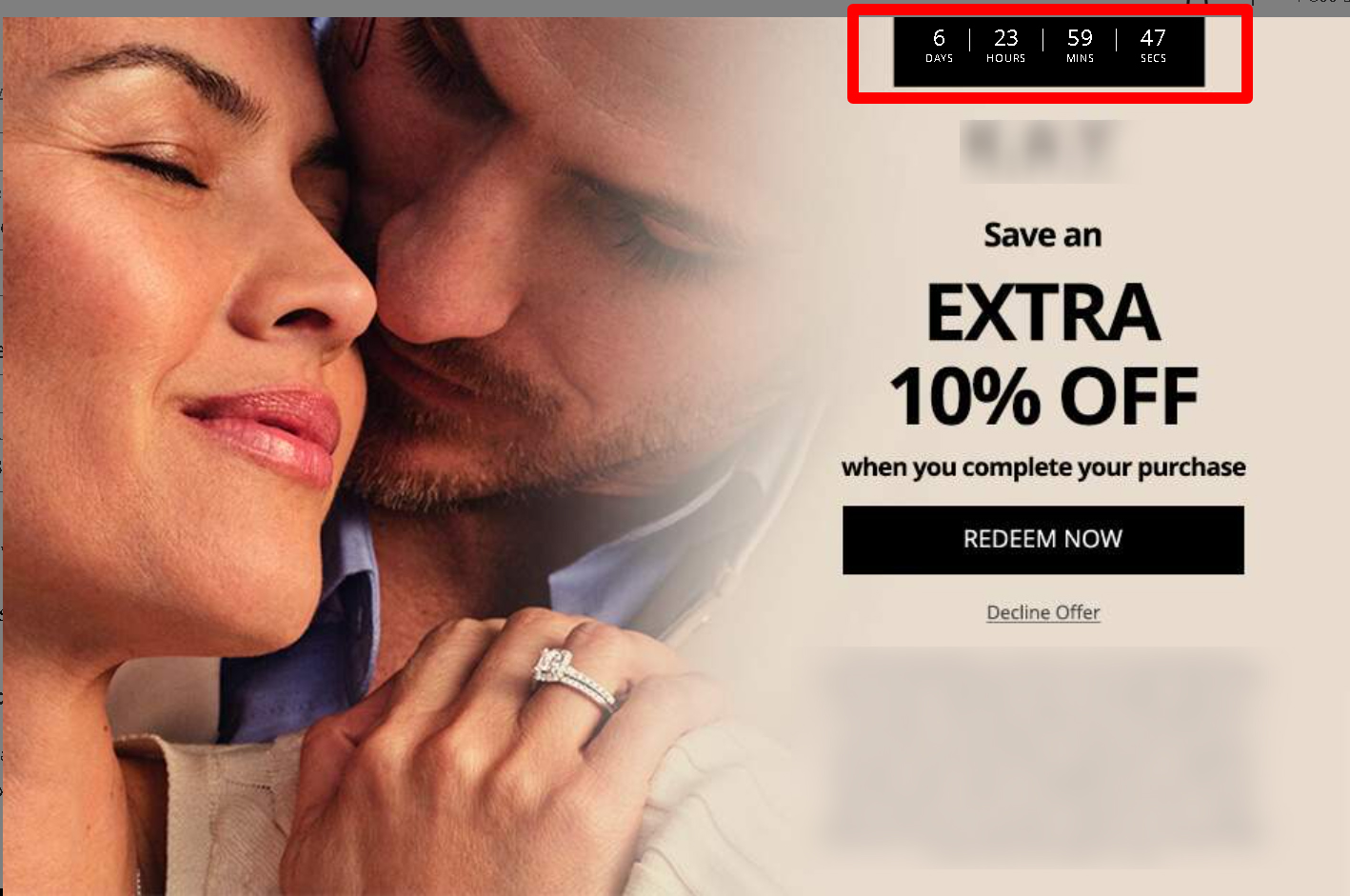
- Countdown Timers : Some sites use a countdown timer or a "limited stock" alert to create a sense of urgency, pressuring you to make a purchase decision more quickly than you might like.
- Forced Account Creation : Some sites might not allow you to make a purchase as a guest. Instead, they require you to create an account, which can lead to them sending you unsolicited marketing emails.
- Difficult Refund Policies : Some sites may bury information about their return and refund policies in fine print or make the process difficult to navigate. This could discourage customers from getting a refund or returning items.
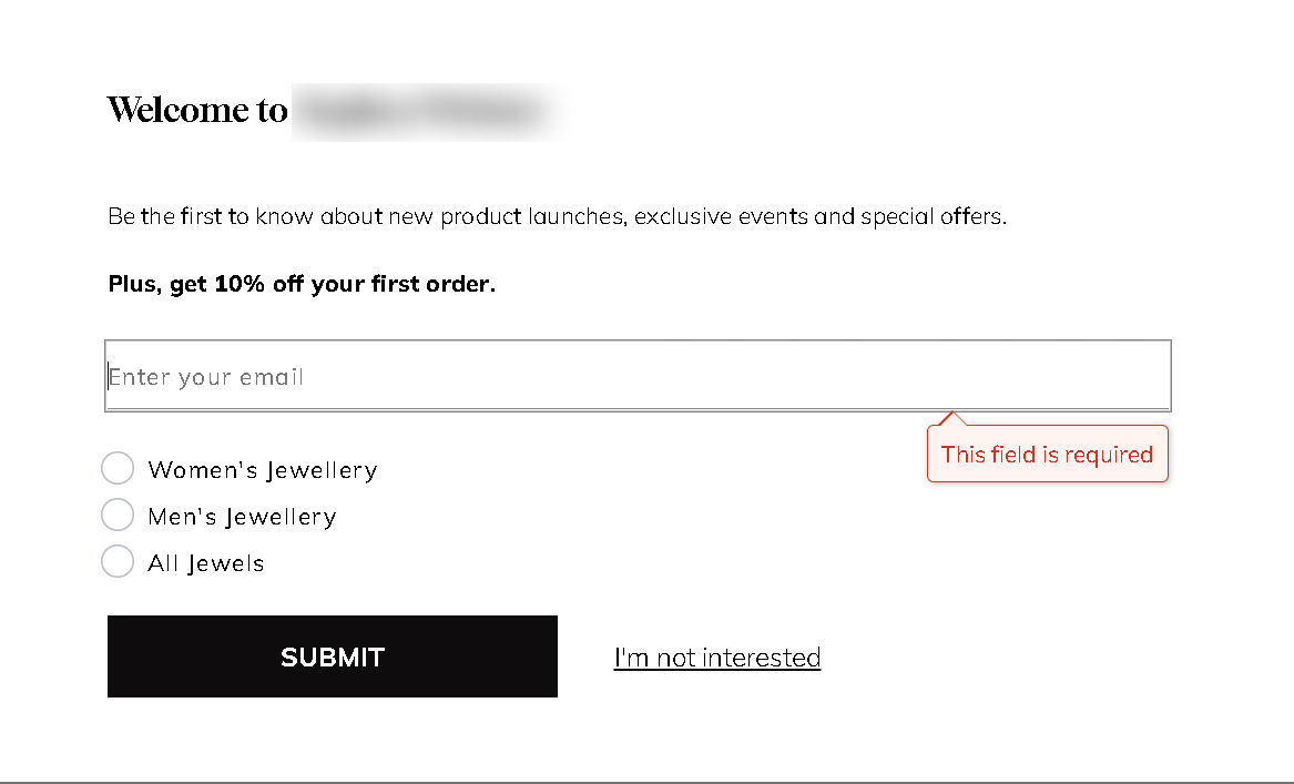
- Email Subscription Pop-ups : When you first visit a site, you might immediately be hit with a pop-up encouraging you to sign up for an email list, sometimes in exchange for a small discount. This can lead to a flood of marketing emails that you weren't fully prepared for.

